UX/UI Internship at Shredsauce
Jun 20, 2020
Part 1 : User Flow Redesign
By testing the game myself, I noticed many things that could be improved in the user flow.

Here are the modifications I thought could be made to improve the game:
Getting Access to a lobby was pretty slow, so I proposed to add some "Quick join" buttons to accelerate the flow.
I proposed to make some changes to the main menu so that players could have access to the different game mode faster (Single player and Online Multiplayer).
My lead told me many players are using the snowboard option instead of the ski, so to accelerate the switch between both of them, I proposed to add a selection in the Main menu instead of in the Settings.
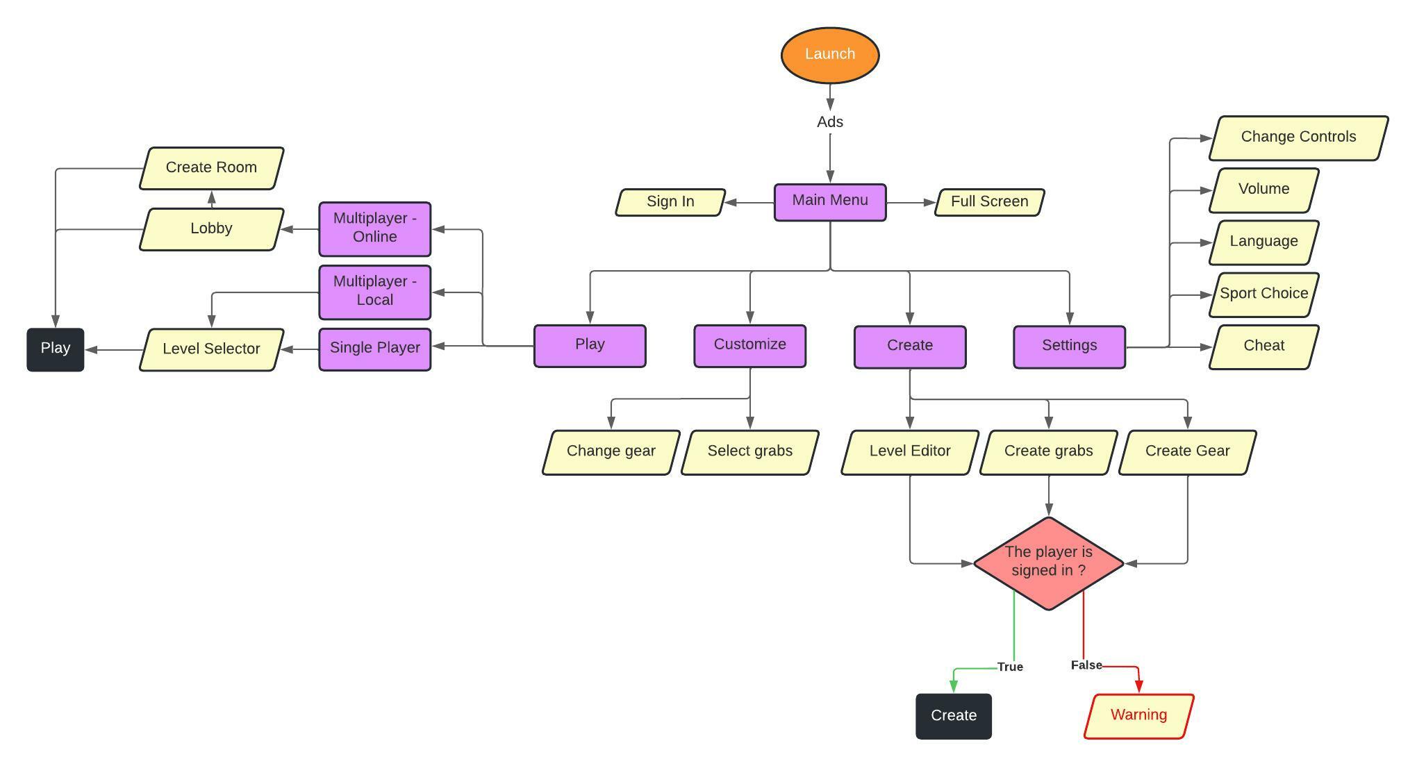
Creation Modes, which are only usable to those who are signed into the game, had a very slow flow, so I proposed a warning message and then show the player where to sign in if they weren't.
So here is the User Flow Redesign that I shared with the team:

The blue line is the User Flow for first time user, since they do not know how to play the game, I suggested that the new players should be sent into the game first before being able to customize their character/grab or the creation menus.
Part 2 : UI redesign
Following the User flow redesign, I redesigned some of the UI inside the game using Figma:
The Main Menu.
The Grab Editor.
The Level Editor.
The Main Menu
Let's start by showing you the Live version of the main menu:

And the final iteration of the redesign :

The Grab Editor
Once again let's start with the live version :

For the redesign, my goal was to improve the selection of the different body part/accessories to make it easier for the player to create/edit grabs. Here is the final result:

The Level Editor
The level editor was the most difficult to redesign out of the 3 menus that I did. Here is the live version:

Finally I just went and redesign the overall layout to make it more enjoyable to use by changing the main text by icons and changing how to features section look, my lead wanted a version where the players could use features created by the community to integrate in their levels. Here is the final result:

I really loved my experience with Shredsauce, the mix of the internship and the overall passion that I had for UX really made me realised that this is what I wanted to do in the future.